Seaworld
Overhauled a dead-end purchase flow into an intuitive, high-converting user journey.
Role → UX Designer
Duration → 8 weeks
Client → SeaWorld [ RFP – Concept Pitch ]
Internal Team → UX Lead, Visual Designer
01
Context
SeaWorld’s digital ticketing experience was struggling- users were leaving, sales were non-existent, and the site flow was a confusing mess. Our team was brought in for an RFP to reimagine what a joyful digital experience could actually feel like: seamless, intuitive, and revenue-driven.
I led the UX strategy from the ground up.
Conducted a heuristic evaluation of the entire ticketing flow
Built an in-depth customer journey map (an architectural nightmare that I’m still very proud of organizing)
Identified dozens of UX blockers- dead ends, disjointed nav, pop-ups, and unnecessary friction
Created wireframes for an optimized purchase path
Collaborated with a visual designer to elevate the prototype for client presentation
02
My role
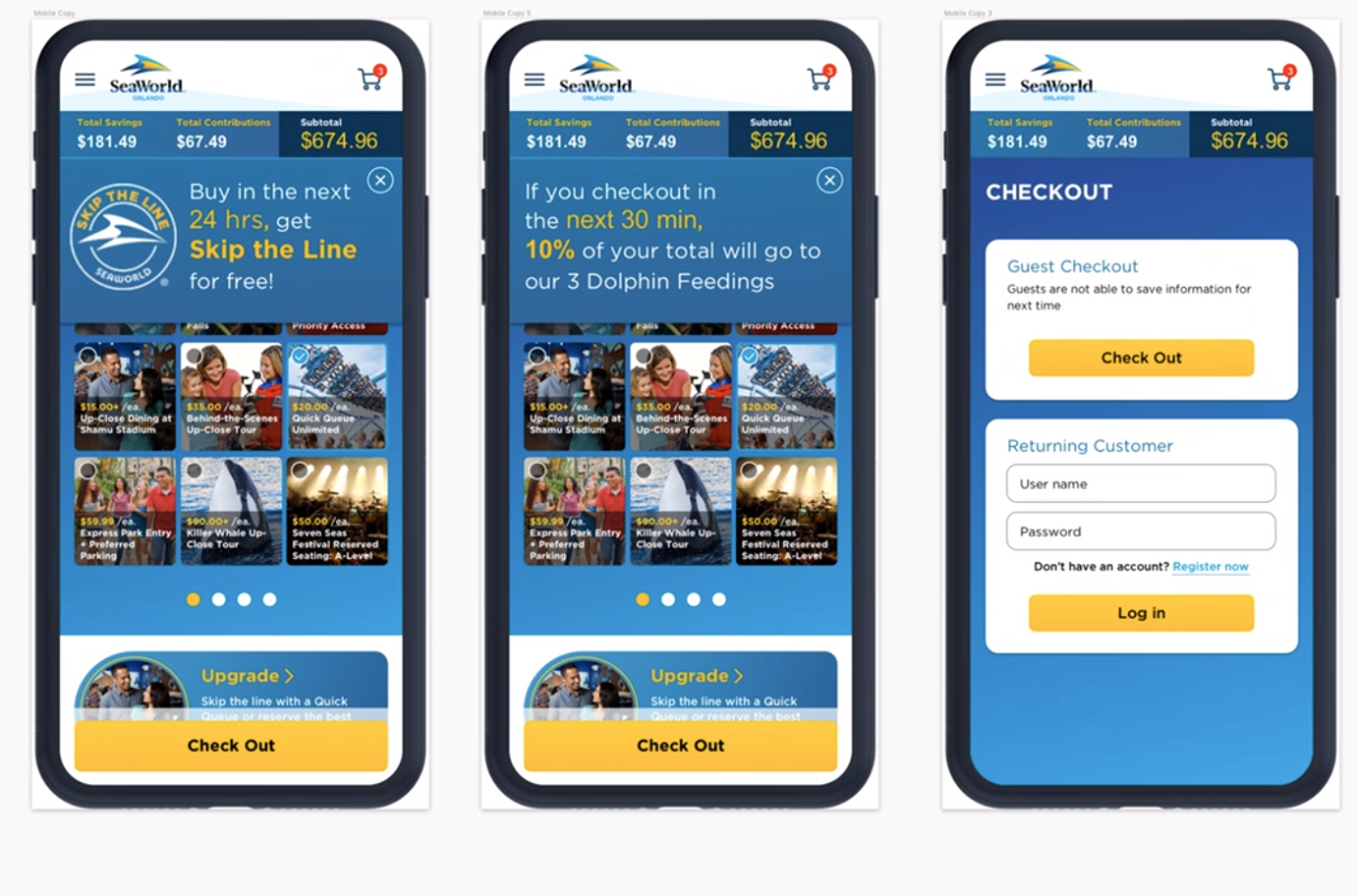
Original state
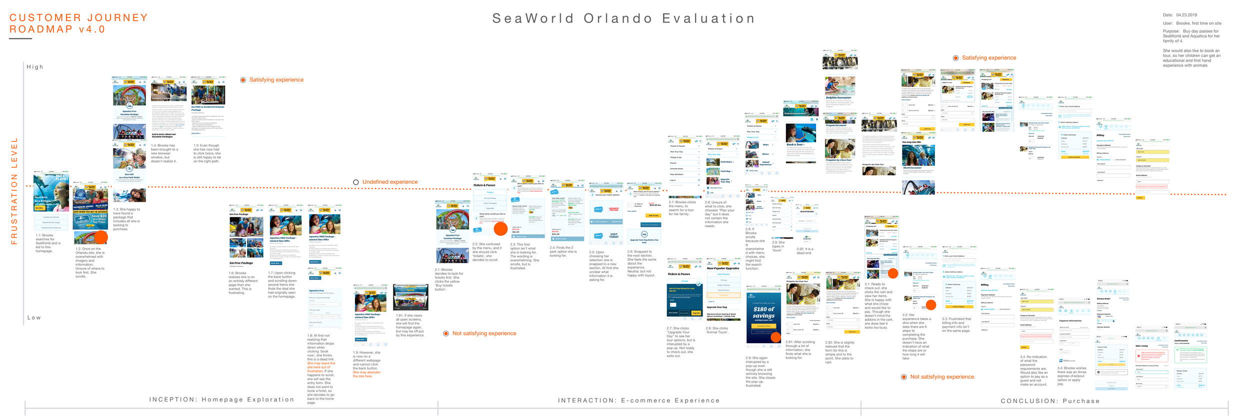
A cluttered maze of dead ends, confusing architecture, and intrusive pop-ups led to high bounce rates and customer frustration from the very first click.
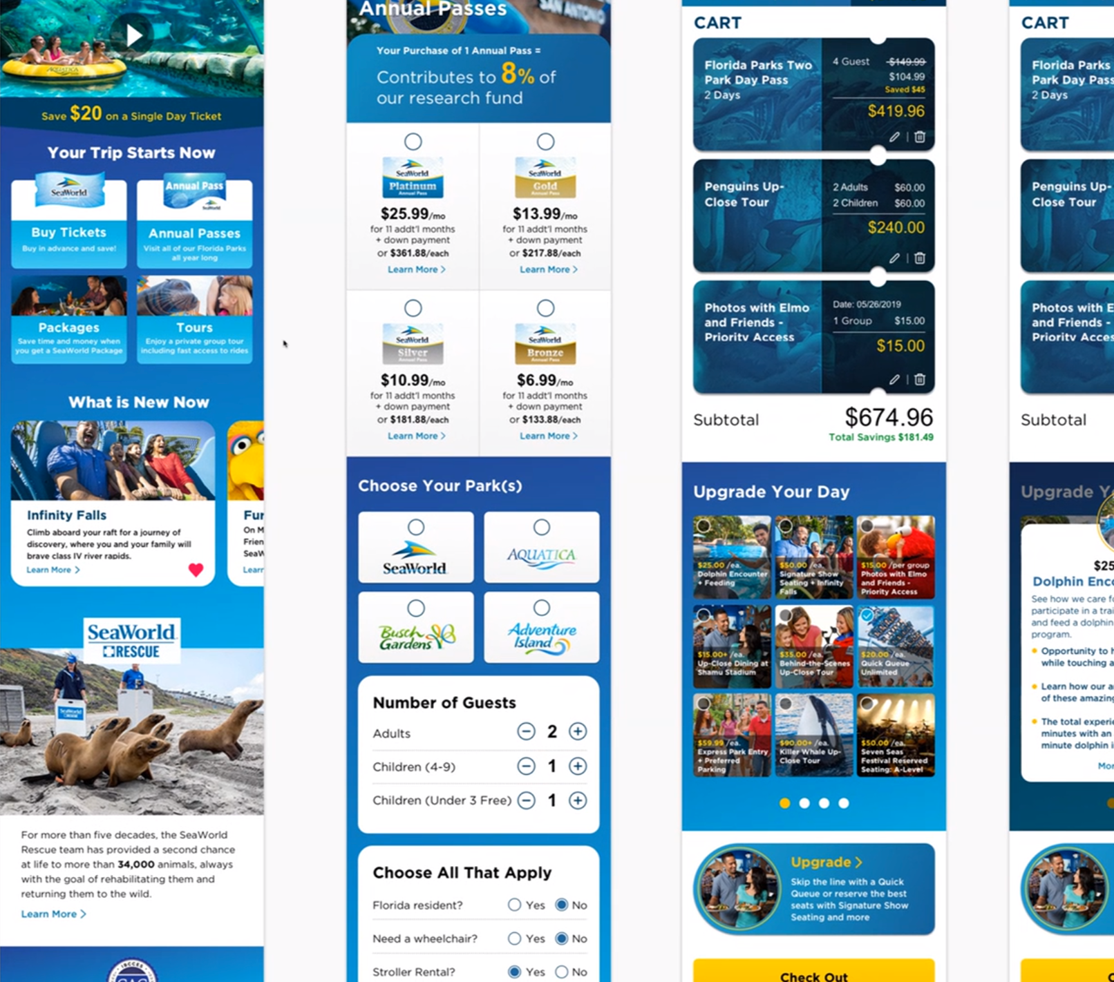
UX Rebuild
Mapped out a clean, intuitive flow with streamlined architecture and simplified visuals, designed to guide users through the purchasing process without overwhelm.

Visual Concepts
Using the new UX foundation, the team collaborated to modernize the interface- bringing it in line with other leading park experiences while maintaining SeaWorld’s brand feel.
Outcome
We won the RFP with this concept. While the final scope pivoted (and I didn’t stay on for the delivery), the work remains a sharp showcase of how thoughtful journey mapping and UX design can transform chaos into clarity. This wasn’t just a pitch- it was an actionable solution.