

Glowceuticals
Individual Project
Project Type: UX Research + Visual Design
The Task
Glowceuticals is an emerging beauty platform that connects its users to skincare products that are natural and exotic. They focus on the ingredients rather than the packaging, so their thoughtful users can see the science behind what they use. I was tasked with designing their first logo.
Research
Glowceuticals is not the typical beauty brand, it’s much more, and defining the user was the first and most important task. Once that was determined, research of other brands and similar startups helped shape the design process.

Ideation + Sketches
The client’s needs were to create a feminine, pink logo, that would appeal to our above persona. I created a mood-board, experimented with color, and then moved on to sketching.


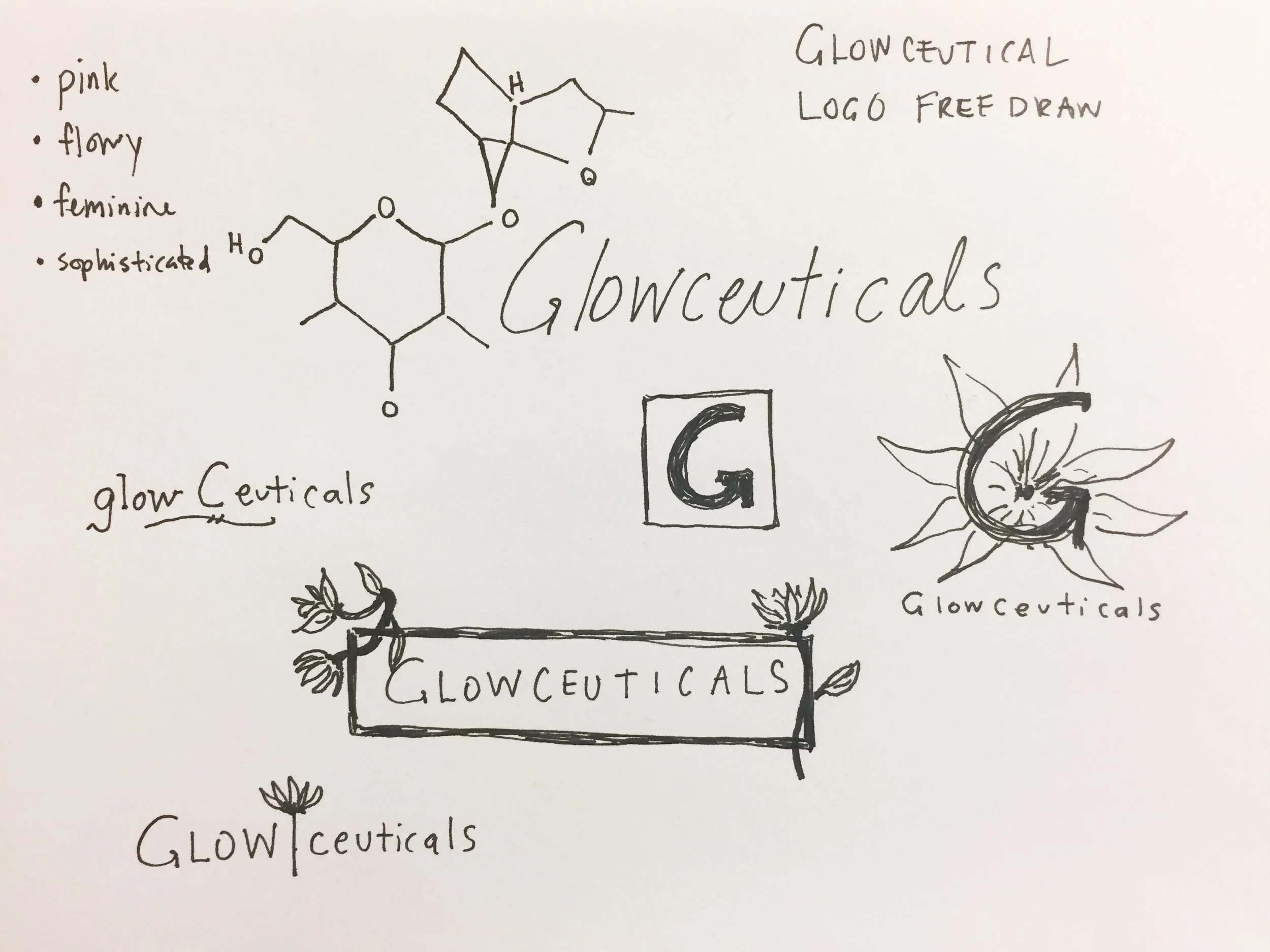
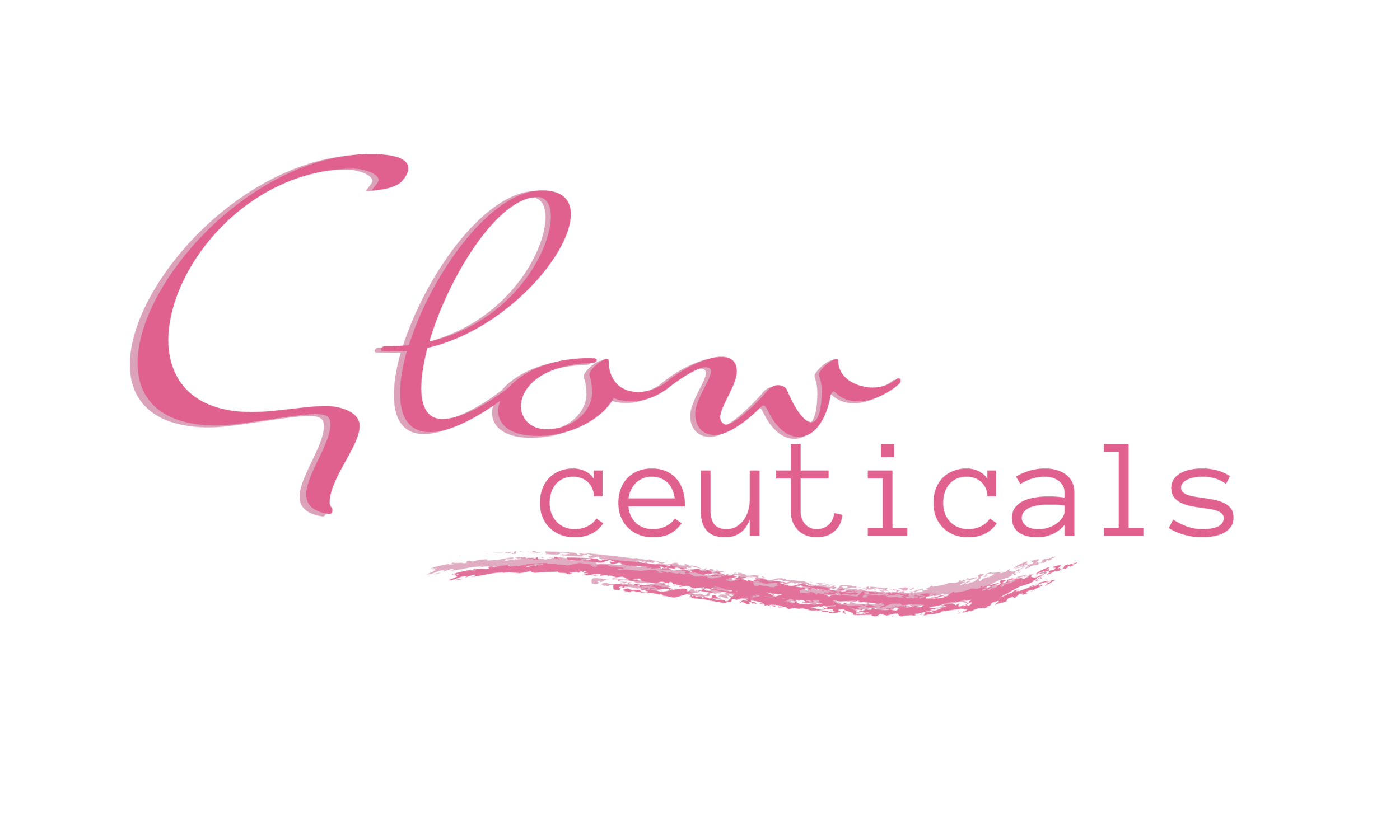
Logos
Because the scope of what the client wanted was broad, I decided it best to create three different designs that followed the style guidelines, but in very different ways. Below are the final three I presented to my client. The first designs use florals and a script type, and are meant to exude femininity and nature.


While staying with a script font, the logos below move into a focus on the brand’s foundation of science and chemistry.


The final logos move into a more modern, typical beauty brand approach.


Reflection
While this project is currently being executed, I can still say that it has been a joy and an absolute learning experience. Visual Design is so personal, and putting someone else’s ideas into existence is such an interesting task. I love that this project has allowed me to follow a full design process, which is something I love to do. Thus far, this has been a completely successful project.