BERT
Internal Ticketing System Redesign
Company → Blue Cross Blue Shield
Role → Lead UX Designer
Duration → 4 months
Tools → Whiteboard, Face to Face Conversations, Sketch
“Designing a centralized system that helped employees breathe again.”
This project began as an on-site collaboration with the internal team at Blue Cross Blue Shield. We were brought in to redesign their ticketing and error reporting system, which had become disorganized and inefficient. Through in-person exploration, observation, and interviews, we aimed to deeply understand their pain points and workflows. The ultimate goal? Create a centralized, intuitive system that not only improved efficiency but genuinely made their day-to-day work easier.
Intro
Conducting in-person user interviews to surface critical workflows, frustrations, and priorities.
Synthesizing research data and presenting insights to stakeholders for alignment.
Facilitating ideation sessions, guiding the team through sketching, whiteboarding, and collaborative strategy planning.
Creating initial low-fidelity wireframes, drawing inspiration from physical post-it note systems and Kanban boards.
Leading the UX strategy from discovery through handoff, ensuring clarity and logic in every interaction.
Building high-fidelity wireframes with a focus on function-first design, providing pixel-precise mockups before color and branding were introduced.
Collaborating closely with our visual designer, who developed the style guide and final UI, layering in a bold and engaging visual system.
Overseeing the UX handoff, while partnering on the final deliverables alongside our visual lead.
Role and Responsibilities
01
The Problem
The client’s internal error tracking process was chaos: sticky notes, unsearchable email chains, and hours of wasted time. No centralized system meant duplicated efforts, missed bugs, and rising tension across dev, QA, and support.
02
Our Goal
→ Centralize all internal error tracking
→ Reduce response time across departments
→ Mimic the mental clarity of sticky notes- without the clutter
→ Make the system intuitive enough for non-technical users
→ Improve transparency and accountability across teams
03
Discovery + Research

We conducted interviews with analysts, requestors, and supervisors- the ones closest to the work.
What we learned:

“I just want to be able to see what’s on my plate... and know when it’s off.”
They were managing hundreds of tickets, often buried in email chains or unsaved Excel files. We mapped user flows, identified mental models, and documented frustrations that turned into requirements and rough sketches.
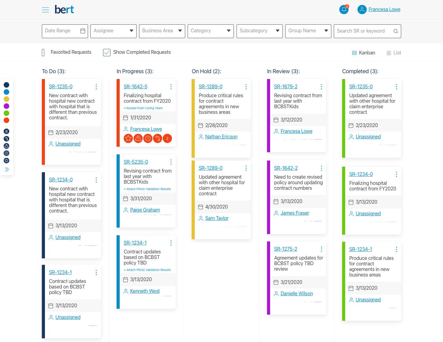
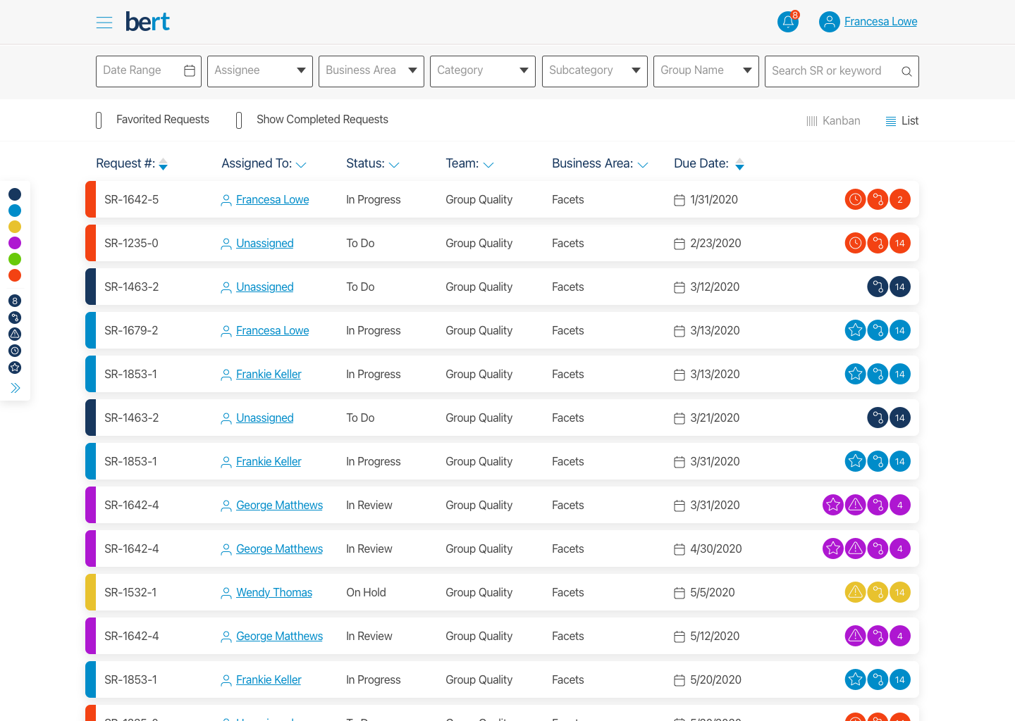
Based on user pain points, we crafted wireframes that leaned into: familiar visual hierarchy (modeled after sticky notes), color-coded urgency, expandable detail views Persistent filters and user roles. We moved from low-fidelity layouts like the box vs list toggles → to scalable design systems that respected their workflow.
04
Ideation + Wireframes

After multiple rounds of feedback and collaboration with stakeholders, we moved into final designs using Sketch, delivering a clickable prototype alongside a detailed, dev-ready PDF. These high-fidelity mockups infused the brand’s visual identity with a clean, modular structure. The final design system featured color-coded task cards with visual indicators, flexible grid layouts to accommodate different user roles, intuitive notification flows, and seamless task previews—all built for clarity, speed, and scalability.
05
High-Fidelity Design
Outcomes + Learnings
This was one of the smoothest, most collaborative projects I’ve ever led- thanks to a talented team, clearly defined ownership, and stakeholders who were genuinely invested in the outcome. We were able to move with intention because we had the space to do things right, folding feedback directly into each new iteration. It was fulfilling to build something that made their work lives easier and gave them a renewed sense of control. I walked away deeply proud of what we delivered and how we delivered it.
→ Delivered a full clickable prototype and annotated PDF for dev handoff
→ Dramatically improved tracking visibility across departments
→ Reduced error duplication by implementing centralized system logic
→ Created a reusable design system for future internal tools
→ Strengthened cross-team trust through a clear, human-centered solution